Museum Logos: Drawing The Line
About a month ago, the Metropolitan Museum of Art changed their logo. You might have seen it:

The change got me thinking about Museum logos more generally, and I started spending more time analysing them. (Because that’s just how fun I am). While looking over a few visual identities, I stumbled across a trend. A harrowing commonality that suggests some international conspiracy between our cultural gatekeepers. I am equal parts scared and excited to present my findings to you today.
Let’s start with one of the all-time great Museum logos: The Victoria and Albert Museum.

What are we looking at here? Sure, it’s the name of the museum, but what’s important is that it’s an abbreviation where the two letters get smushed together along a diagonal line. It’s a simple way of depicting the different disciplines of the Museum, while simultaneously symbolising the influence of both Victoria *and* Albert.
I thought I’d noticed this quirk somewhere else, and then I recognised it in the logo of my own workplace, the Museum of Applied Arts and Sciences:

The two As here are once again cut in half across a diagonal line. “So far, big whoop.” I hear you cry.
I checked my findings by looking at another big Museum in Sydney, The Australian Museum, and I was shocked.

They’ve taken letter smushing to a new level. Not only are the A and M connected, but they’re the same shape. If you had orange-red colour blindness (which I don’t think is a thing but whatever) you wouldn’t even be able to tell them apart.
I looked elsewhere in Australia, to Museum Victoria:

Not only do the diagonal lines touch, but they’re overlapping! And if you look closely (which clearly I have), there are even diagonal lines in the background!
At this point I started to panic. I needed more data. Maybe this was just an Australian thing. Let’s pick a country at random. Poland? You got it. Here’s the National Museum of Warsaw:
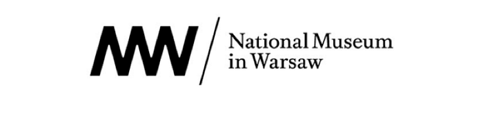
At this point there aren’t even distinct letters. The lines have taken over completely. The company that did the design work for them even started plotting what would happen if the logo went on forever:

Where can we find some salvation? Surely America, land of the free, has not yet succumbed to the tyranny of diagonal li-
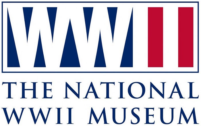
No! National WWII Museum! Is there anyone who can put up a resistance?
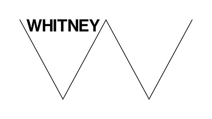
WHITNEY! At first glance it looks like they too have fallen; trapped with a W in their name. But if you look closely, the Whitney’s full name is the Whitney Museum of American Art. They’re conducting a valuable piece of subterfuge to avoid a much longer diagonal line for the full WMAA.
Which brings us back to the Met. Their full name is ‘the Metropolitan Museum of Art’, but they go by ‘the Met’ these days. (You can’t expect a museum to use the name ‘MMA’, lest a legion of Mixed Martial Arts fans attend en masse, disappointed and angry that they can’t watch the legendary Mauricio “Shogun” Rua break someone’s spine.) So maybe they’ve pulled a Whitney and fought back against the diagonal lines? Well. Look at the Met’s logo. Now back to me. Now back at their logo, now back to me. What do you see? They’ve fallen prey to the smushed-letter conspiracy too.
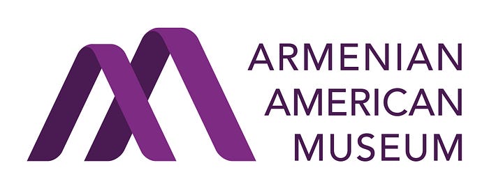
And what for the future? The ‘intersecting diagonal line’ continues to develop into 3D form for the Armenian American Museum:
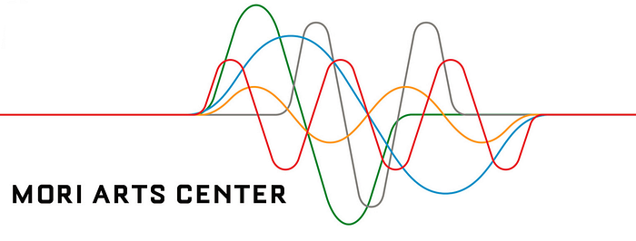
Meanwhile in Asia, the lines are taking some unsettling new forms. The Mori Arts Center has dispensed with the points altogether:
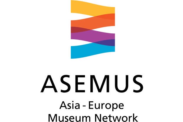
And the Asia — Europe Museum Network looks like its trying to cover up their diagonal lines with a subtle 90° tilt:
But how could this come to be?
Someone more naïve than me would say this conspiracy (and yes, it’s a conspiracy) of smushy-letter-diagonal-lines is merely the product of design firms finding it hard to capture the multi-faceted work of what a museum does. But I say no! There is clearly a powerful shadowy network behind all this.
What sort of Museum organisations could be responsible for such a thing? The American Alliance of Museums?

Seemingly benign events like Museum Week?

No. This can only come from the international organisation with the most important diagonal-line logo of all:

But not all is lost. We can still fight back. Today, brothers and sisters, I would like to propose a new international coalition to keep these logos in check: the Worldwide Art Museum Name And Visual Identity Nomenclature Merging Awareness Association, or WAMNAVINMAA. I’ve already taken the liberty of drafting our logo:

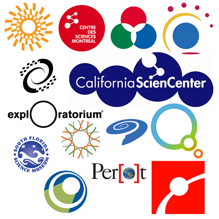
Oh, and be prepared, Science Centers. I’ve already started researching your logos, and I’ll be uncovering the conspiracy there as well, just as soon as I can figure out what they all have in common.